All posts

The Vibecode Test

Brad
Founder & CEO
Mar 16, 2026
Accounting
Hero Actions

Try something. Open your favorite AI coding tool. Cursor, Claude Code, Copilot, whatever you prefer. Vibecode a simple internal app. A invoice entry form. An employee dashboard. A journal approval screen with a clean UI.

It'll take you maybe 10 minutes. Maybe less.

Now, try to build that same page inside your enterprise platform.

Don't worry about getting the plumbing working. Don't worry about the backend, the data layer, the integrations. Just the UI. Just the screens. The buttons, the layout, the flow. The stuff your people actually see and touch every single day.

If you can't even match the front end, you just failed the Vibecode Test. And that should worry you.

The Test Is Simple

The Vibecode Test isn't a formal benchmark. It's a gut check. Take any screen your employees use every day, then ask: could a single developer with an AI coding assistant build something better looking and better feeling in an afternoon? Not a working system. Just the experience layer.

For most legacy enterprise platforms, the answer is yes. And it's not even close. We're not even talking about functionality here. We're talking about whether the platform can produce a page that looks like it was designed in the current decade. That's the bar. And most can't clear it.

The interfaces your people stare at for eight hours a day were designed in an era when Angular 2.0 was cutting-edge. When mobile-responsive meant shrinking a desktop layout. When "modern UI" meant rounded corners on a button.

Those screens haven't meaningfully changed. But the world around them has accelerated beyond recognition.

We Learned This the Hard Way

At Dayos, we lived this problem firsthand with ServiceNow.

We needed a modern, branded experience for our internal IT operations. ServiceNow's native portal framework couldn't deliver it. Not close. So we did something nobody else had done: we built a fully decoupled Next.js front end with Auth0 authentication, hosted externally on Vercel and AWS, pulling data from ServiceNow via REST APIs and OAuth 2.0.

It worked. The community noticed. We were the first to integrate ServiceNow's domain separation with Auth0's organization management for a proper B2B multi-tenant experience.

But here's what nobody talks about: the moment you decouple the front end entirely, you've reduced your enterprise platform to an expensive API layer sitting on top of a database. At that point, the honest question becomes: why are we still paying for this?

We asked that question. The answer led us to retire the system entirely.

That project is now an IMDA case study. Forty-five days to migrate. Sixty percent auto-resolution on tickets from day one. Over $121,000 in annual savings. Not from optimizing ServiceNow. From replacing it.

Angular 2.0 Is a Tell

Here's the thing about legacy enterprise UIs: they're a visible signal. Every employee who uses a clunky portal at their job, then opens a vibecoded prototype on their laptop, sees the gap instantly. The outdated interface tells them the vendor stopped investing in experience years ago.

ServiceNow's Service Portal runs on AngularJS (not even Angular 2, the original 1.x framework that Google stopped supporting in 2022). Their newer "Next Experience" framework is better, but it's still a walled garden. You can customize within the boundaries they set. Step outside those boundaries and you're fighting the platform, not building on it.

This isn't unique to ServiceNow. Oracle's VBCS pages look like they were designed for a browser from 2015. SAP's Fiori tiles are clean but rigid. Legacy HR and finance interfaces are functional but cannot be extended beyond what the vendor deemed good enough a decade ago.

Every one of these platforms fails the Vibecode Test.

The Gap Is Only Getting Wider

A year ago, building a polished front end required a skilled React developer and a few weeks of effort. Today, a product manager with Cursor can vibecode a working prototype in hours. The quality floor for "good enough" software has risen dramatically, and it's still climbing.

Meanwhile, enterprise vendors are shipping incremental UI refreshes on top of architectures designed a decade ago. The delta between what AI-assisted developers can produce and what these platforms deliver out of the box grows every quarter.

Your employees notice. Your new hires definitely notice. And your customers, if they interact with any of these portals, absolutely notice.

The Numbers Behind the Problem

This isn't just a feeling. The research on enterprise UX is brutal, and it paints a clear picture of what bad interfaces actually cost.

Forrester Research found that every $1 invested in UX returns $100, a 9,900% ROI. Flip that around and you see the real story: every dollar not invested in UX is compounding against you. McKinsey's landmark study of 300 publicly listed companies over five years found that companies in the top quartile for design practices saw 32% higher revenue growth and 56% higher total returns to shareholders than their peers. Design isn't decoration. It's a financial performance indicator.

On the cost side, the damage from poor enterprise UX is staggering. Freshworks' 2025 Cost of Complexity Report surveyed 700 professionals globally and found that employees lose nearly seven hours every week to complicated processes and fragmented tools. That's almost a full day of productivity gone, every week, per employee. The same report found that software complexity drains an average of 7% of annual revenue. For IT teams specifically, 28% cited clunky or outdated UX as a top challenge. For CX teams, 42% pointed to uncustomizable workflows as their biggest frustration.

Then there's the feature problem. Pendo's research across hundreds of software products found that 80% of features in the average enterprise application are rarely or never used. That translates to an estimated $29.5 billion in wasted R&D spend across public cloud companies alone. The features get built, shipped, buried inside a dated interface, and forgotten. Not because they're bad ideas, but because the UX makes them invisible.

Meanwhile, 94% of first impressions are design-related (Forrester), and 75% of users judge a company's credibility based on its interface design alone. Your enterprise platform's portal isn't just a tool. It's a statement about how seriously your organization takes the people who use it.

The connection between these numbers and the Vibecode Test is direct. When a single person with an AI coding assistant can produce a more intuitive, more usable interface in hours than what your vendor has shipped after years of development cycles, those research findings stop being abstract. They become your operating reality.

What This Means for Enterprise Leaders

The Vibecode Test isn't about replacing your ERP or your ITSM platform overnight. These systems hold critical data, run important workflows, and have deep integrations across your organization.

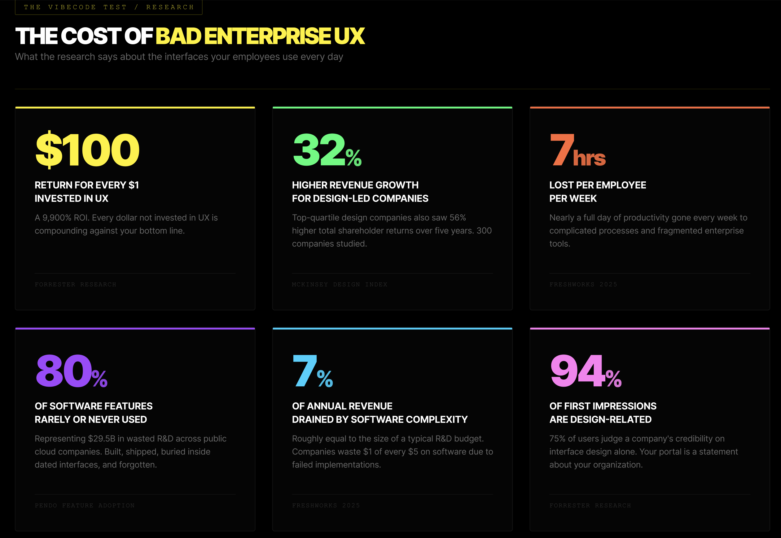
But it is about asking harder questions.

If your platform's UI is so locked down that you need to build a completely separate front end to deliver a modern experience, something is fundamentally broken. You're paying enterprise license fees for a backend you could replace with well-designed APIs and a database. The vendor is charging you for a UI that actively reduces your people's productivity.

The companies that recognize this early will have a significant advantage. They'll stop throwing money at platform customizations that still look dated. They'll stop accepting "that's just how enterprise software looks" as an excuse. They'll start measuring their tools against what's actually possible today, not what was impressive five years ago.

The System of Record Problem

Here's the deeper issue that most enterprise vendors hope you won't think about too carefully.

The traditional defense for legacy platforms has always been the same: "We're the system of record." The data lives here. The transactions run here. The audit trail is here. That status has been the moat protecting these platforms from disruption for decades, and it's the reason enterprises have tolerated terrible UX for so long. You don't rip out your system of record because the screens are ugly.

But the Vibecode Test exposes something those vendors should find alarming. If the experience layer can be rebuilt, decoupled, or replaced entirely by AI-assisted development, the "system of record" defense shrinks down to one thing: the data. And a system of record that cannot evolve its interface to keep pace with AI development advancements is a system of record on borrowed time.

The velocity of UI innovation is accelerating every quarter. AI tools are getting better at generating interfaces, not plateauing. A platform that can't match that pace isn't standing still. It's falling behind at an increasing rate. At some point, the gap between what AI can produce and what the legacy platform delivers becomes so wide that the switching cost of migrating the data starts to look reasonable compared to the productivity cost of keeping it where it is.

That's the existential risk for every legacy enterprise vendor clinging to "system of record" as their value proposition. The data is important. But data without a usable interface is just a database. And databases are commodities.

Run the Test

Here's the challenge. Pick one screen your team uses daily inside your enterprise platform. The busiest one. The one people complain about.

Then vibecode a replacement. Use Claude, Cursor, Copilot, whatever tool you prefer. Give yourself two hours. Don't wire up a single API. Don't connect a database. Just build the interface. The pixels. The interactions. The experience.

If the vibecoded version is better (and it will be), remember: you didn't even build the hard part. You just built the part your vendor has had years and billions of dollars to get right. And you beat it over lunch.

The question isn't whether the Vibecode Test exposes a gap. It's what you do about it.

Share this post